GOSA®
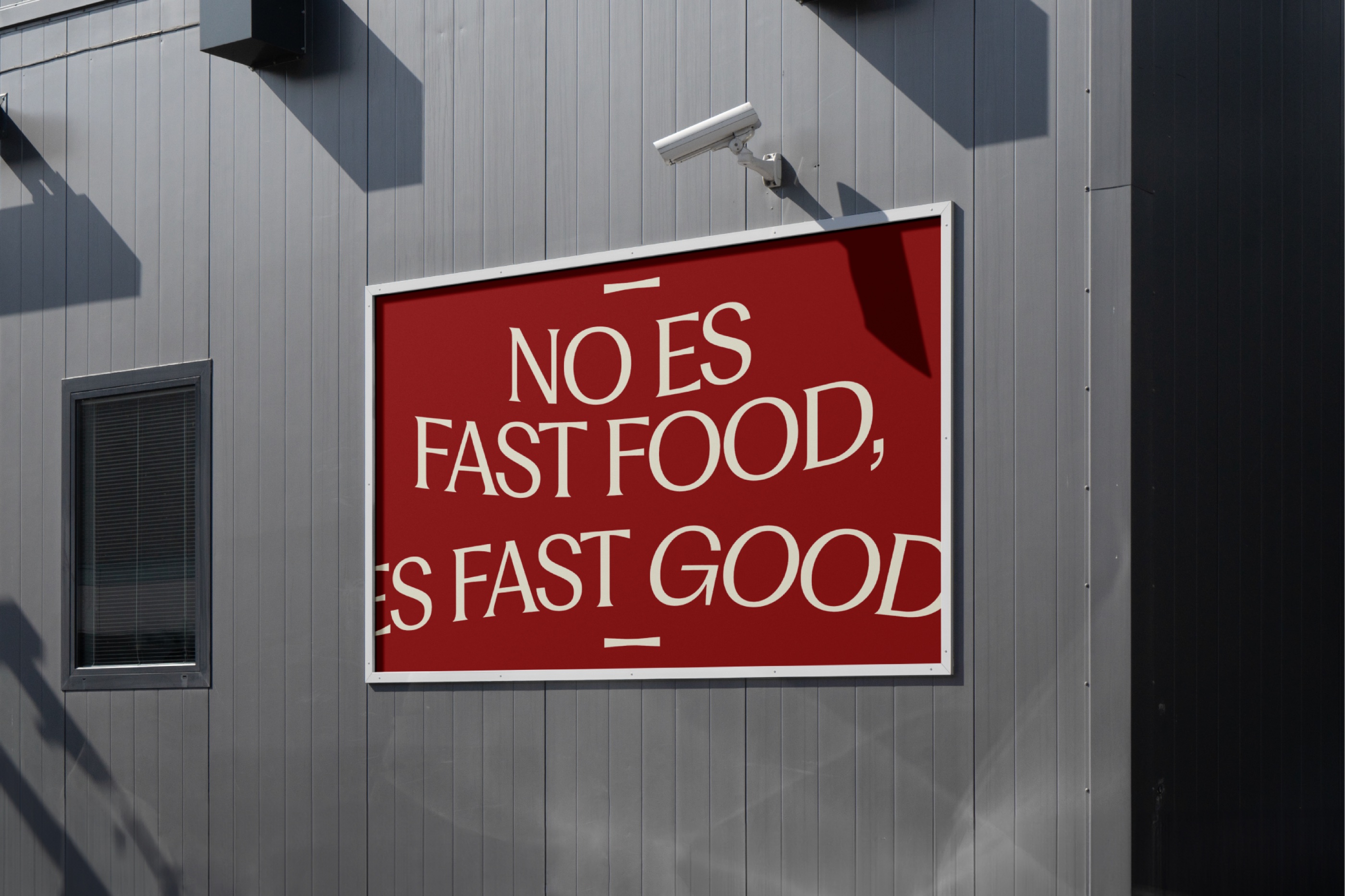
A contemporary Italian-inspired sandwich concept built to prove fast food can still be generous, carefully made and full of character. Not fast food: Fast Good.
The sandwich category meant predictable ingredients and low-value experiences. We had to build a complete brand that elevates it, without becoming formal, slow or inaccessible.
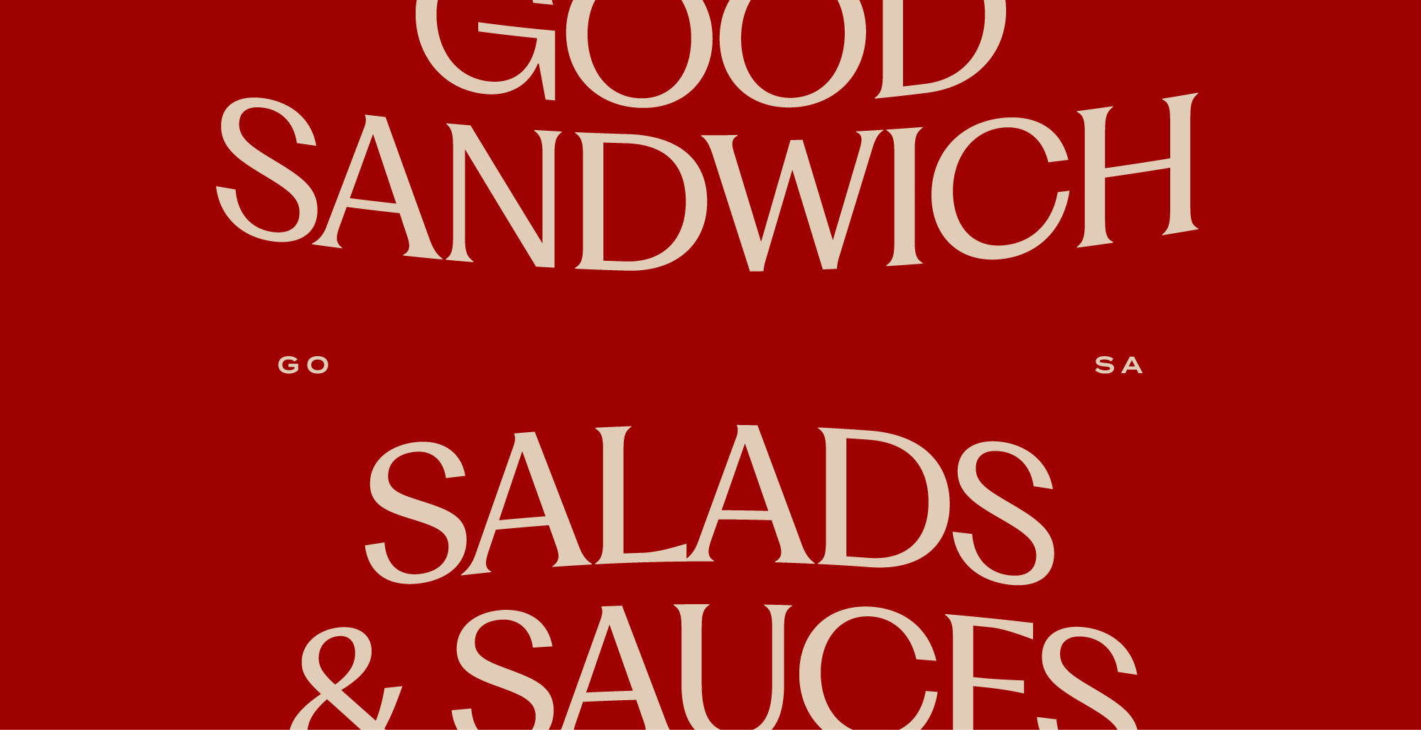
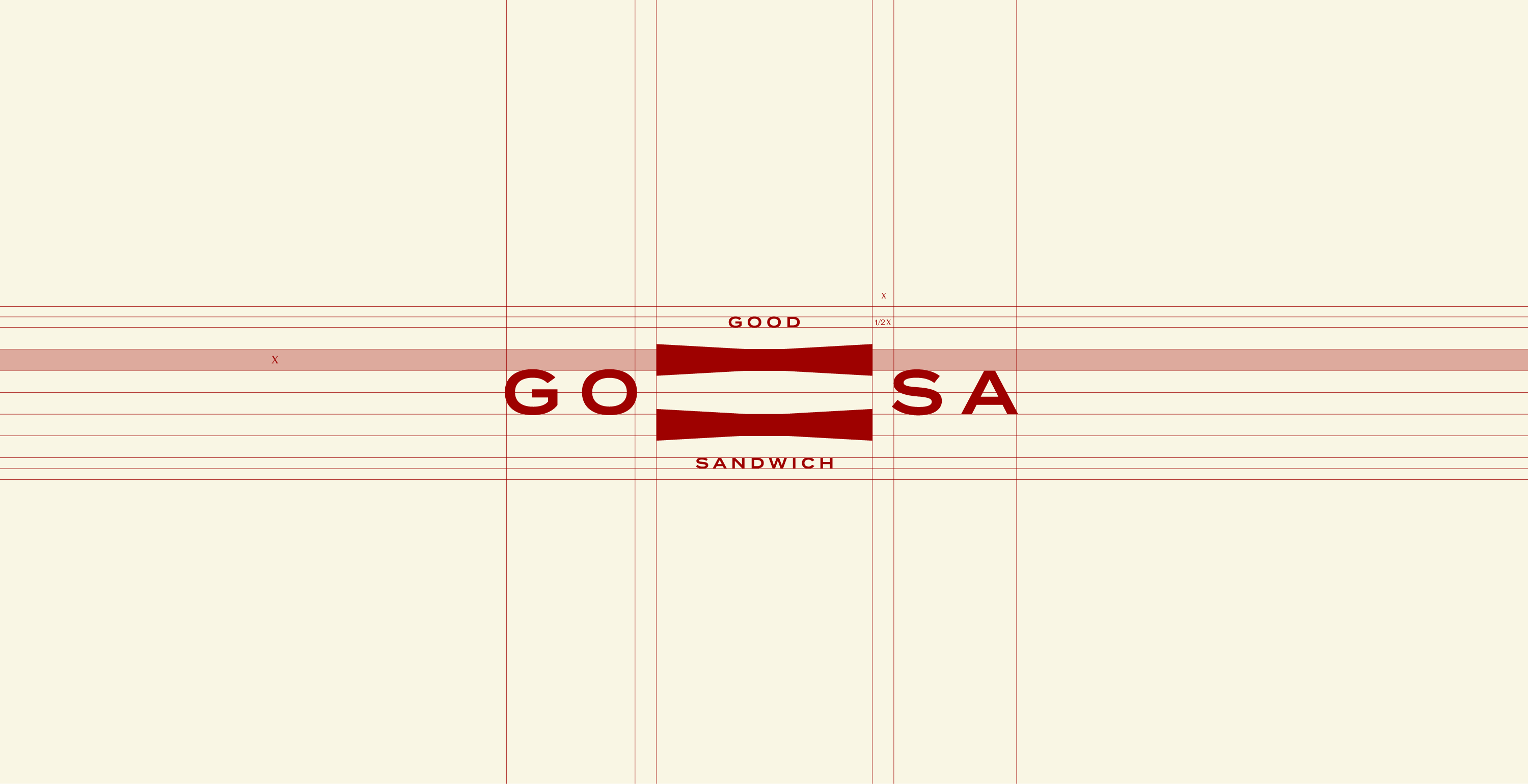
Strategy, naming and identity grew from one belief: high-quality food doesn't have to take forever. GOSA comes from Good Sandwich; the system is inspired by pressing a sandwich before the first bite, compressing its layers into a flexible graphic language.
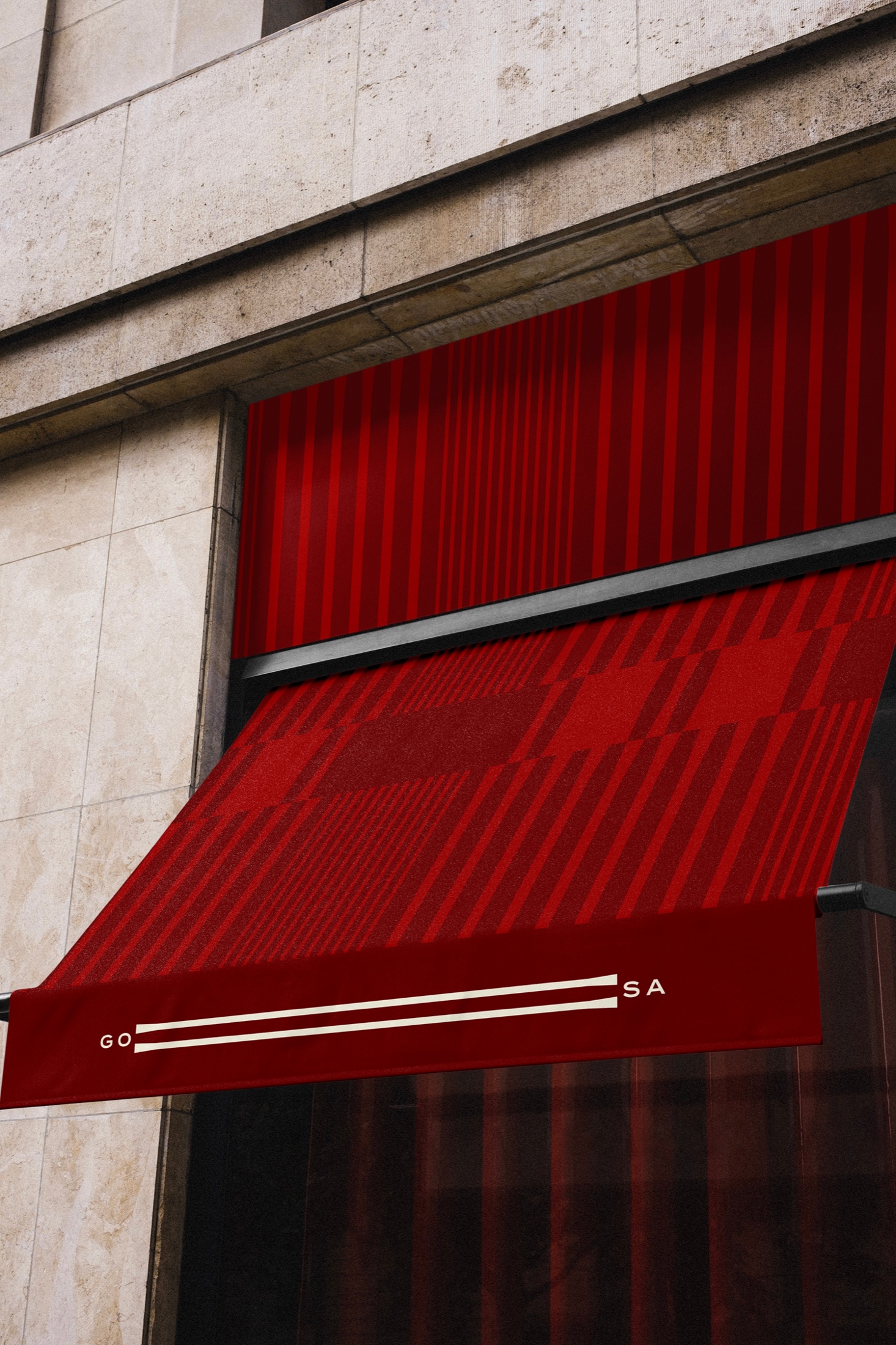
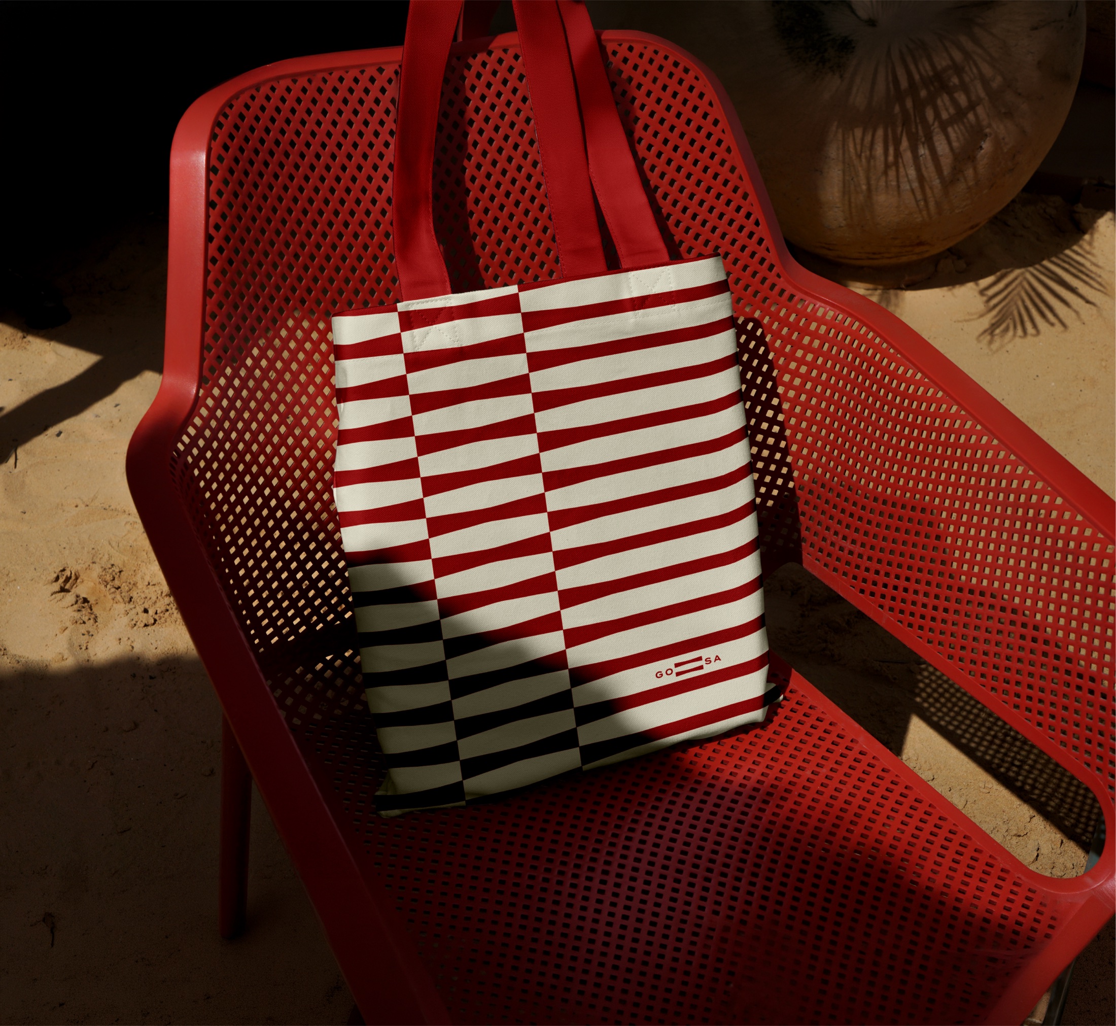
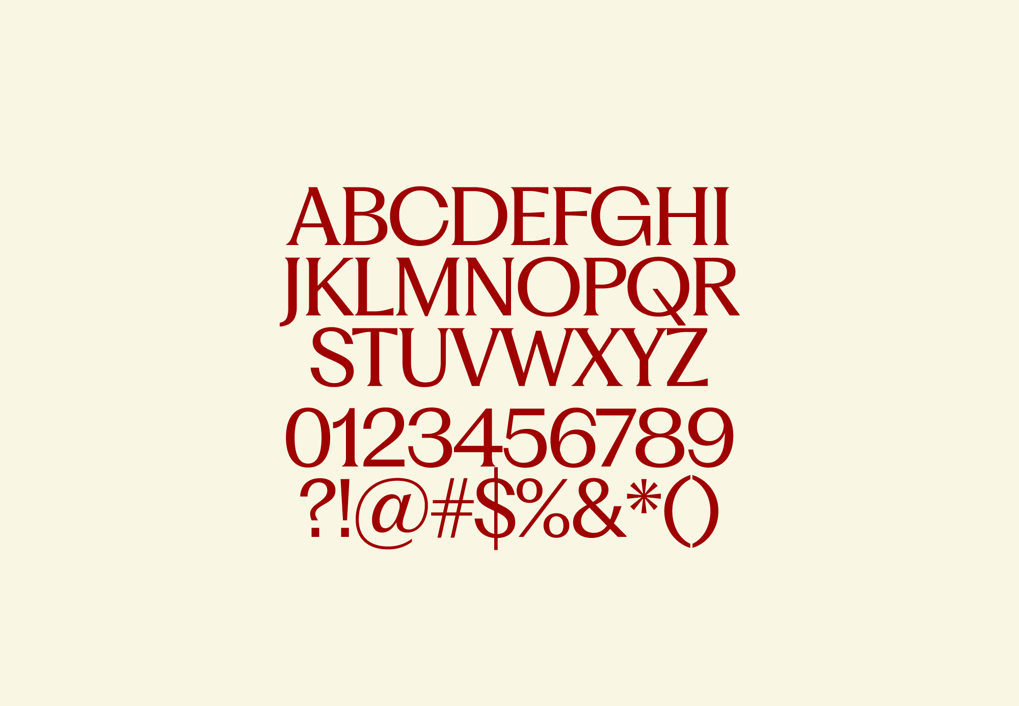
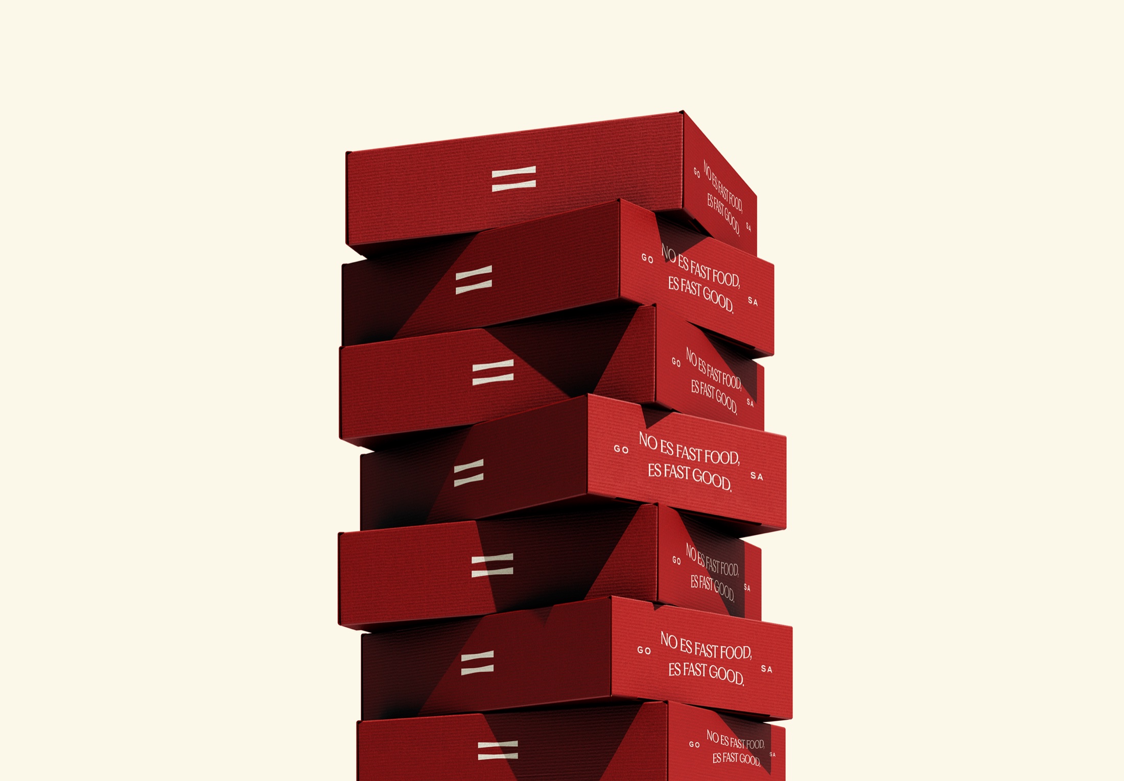
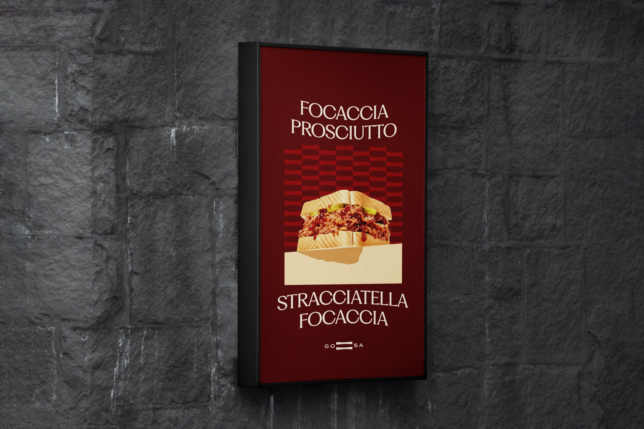
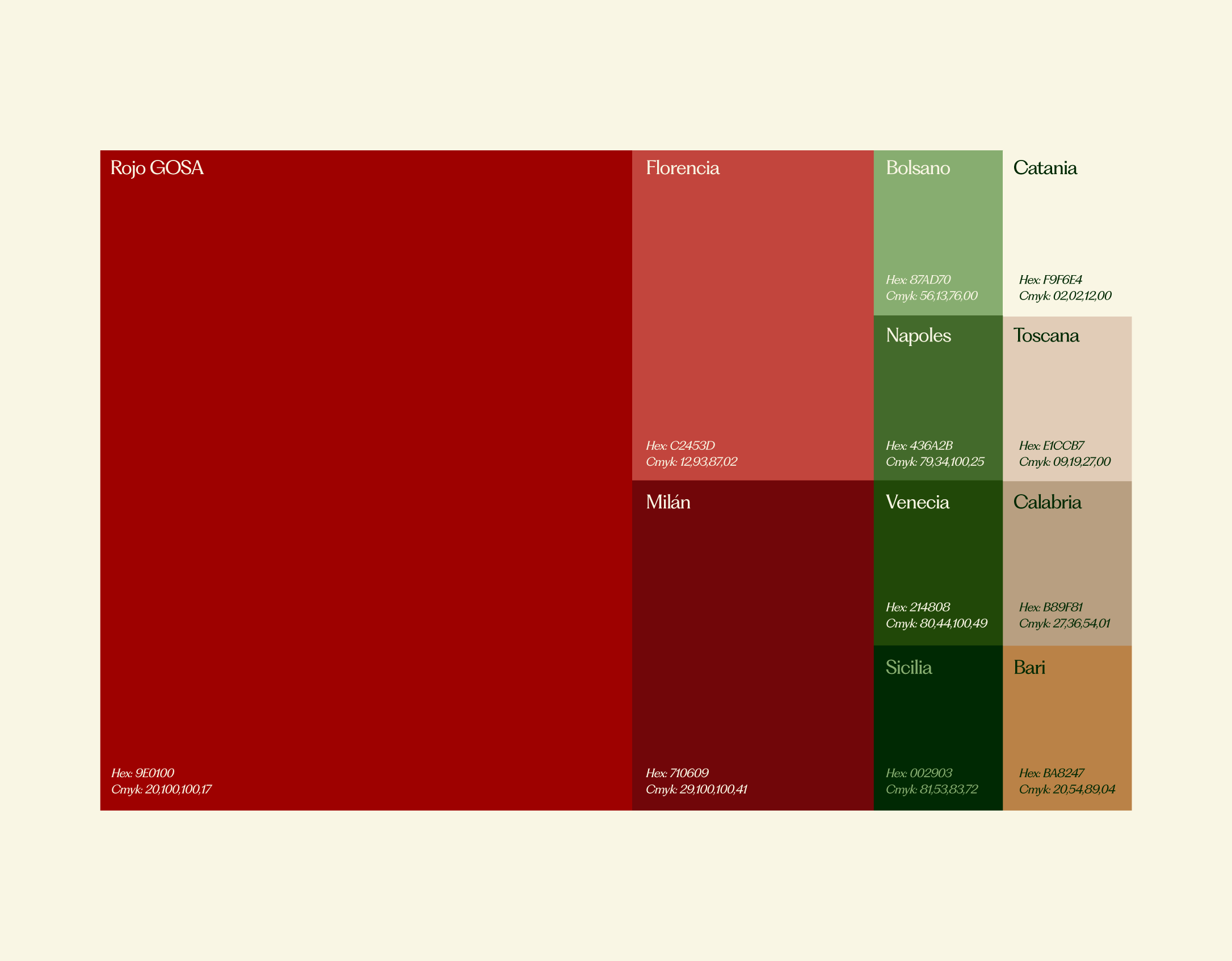
A bold, adaptable system that works across packaging, signage, uniforms, photography and communication, giving the sandwich a new sense of pride.
Fast by nature. Good by choice.